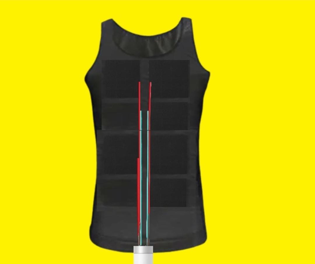
Hardware and more

This page is to present our hardware model and more ways we plan to implement it in.


Other ways it can be implemented


Upperbody suit

This is a graphical plot of the raw crash data from Utah. The green is a crash, and we used coordinates to plot it. It is very explicit in showing how concentrated the crashes are in certain areas, and the vast amount of crashes are shocking as well. Note these are real crashes, not predicted ones.

Jacket

This graphical visualization shows the streets and roads on a map, with latitude and longitude. The purple and yellow display roads and streets, and it shows where crashes occur. The blank is areas without roads. This is more representative of what city planners would create by hand, but we automate the process and include raw crash data.

Back neck band

This is a graphical plot of the raw crash data from Utah. The green is a crash, and we used coordinates to plot it. It is very explicit in showing how concentrated the crashes are in certain areas, and the vast amount of crashes are shocking as well. Note these are real crashes, not predicted ones.

Shoulderband

This graphical visualization shows the streets and roads on a map, with latitude and longitude. The purple and yellow display roads and streets, and it shows where crashes occur. The blank is areas without roads. This is more representative of what city planners would create by hand, but we automate the process and include raw crash data.

Kneecap

This is a graphical plot of the raw crash data from Utah. The green is a crash, and we used coordinates to plot it. It is very explicit in showing how concentrated the crashes are in certain areas, and the vast amount of crashes are shocking as well. Note these are real crashes, not predicted ones.

Footwarmer

This graphical visualization shows the streets and roads on a map, with latitude and longitude. The purple and yellow display roads and streets, and it shows where crashes occur. The blank is areas without roads. This is more representative of what city planners would create by hand, but we automate the process and include raw crash data.

Headband

This is a graphical plot of the raw crash data from Utah. The green is a crash, and we used coordinates to plot it. It is very explicit in showing how concentrated the crashes are in certain areas, and the vast amount of crashes are shocking as well. Note these are real crashes, not predicted ones.